With its recent product releases, Apple has once again shown that it prioritizes form and design over functionality. The new USB-C Magic Mouse and the redesigned Mac mini both feature puzzling design elements, prompting questions about Apple’s design philosophy.
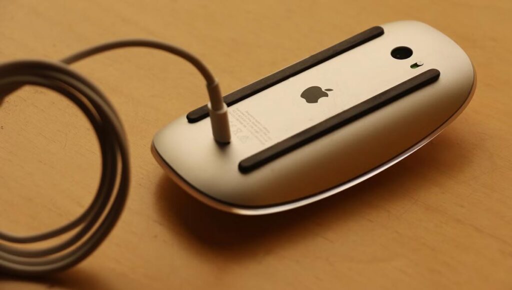
In 2015, Apple made a controversial decision by placing the charging port of the Magic Mouse 2 at its base, rendering the mouse unusable while charging—a design choice that was widely criticized and ridiculed by both critics and users. Despite many people appreciating the Magic Mouse, they often acknowledge the odd and impractical location of the charging port underneath.

Nearly a decade has passed since the Magic Mouse was first introduced, and although Apple has moved to USB-C for charging, the port location has remained the same. With the release of the new USB-C Magic Mouse, Apple had an excellent opportunity to improve the design by moving the charging port to the end of the mouse. This would have allowed users to keep using the mouse even when it was plugged in, with minimal impact on its appearance.
The New Mac mini’s Power Button Is Also on the Bottom!
In the same week Apple launched the USB-C Magic Mouse, it also introduced a redesigned Mac mini, featuring M4 and M4 Pro chips. While the hardware upgrades have been widely praised, the design choices continue to raise eyebrows.

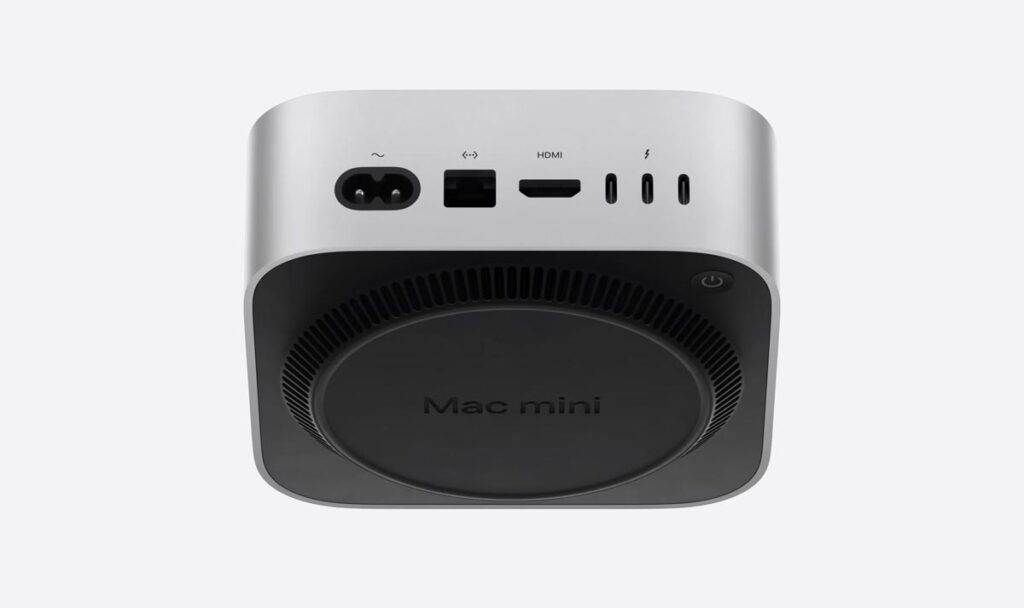
Much like with the Magic Mouse, Apple has chosen to use the underside of the Mac mini for a key function—this time, the power button. Apple apparently considers the bottom of the device to be an appropriate location for the power button, requiring users to lift the Mac mini to power it on or off.
Certainly, as many Apple fans have pointed out, you won’t need to use the power button often, but that’s beside the point. A key component of any device should not be hidden and hard to access. Doing so is not user-friendly, even if Apple’s devoted fans who find it hard to admit that Apple could make a mistake think otherwise.
Although the new Mac mini may be an excellent device for many users, placing the power button at the bottom is far from ideal.
Why Apple Should Stop Prioritizing Appearance Over Functionality
It’s undeniable that Apple has built a reputation for creating beautiful products. However, form should not take precedence over function. When designing products for the masses, as Apple does, end-users should be the primary focus. If this focus shifts, it ultimately hurts customers.
Having a beautiful design is important, and many of us appreciate clean lines, minimalism, and great aesthetics. After all, when we pay a premium for a product, we expect it to look good. But a pleasing appearance should never take priority over meeting the user’s needs.
Apple certainly has its reasons for this approach and has likely weighed the pros and cons of placing necessary elements in particular locations. However, with the specific choices made in the Magic Mouse and Mac mini, it seems the company hasn’t achieved the ideal balance.
Source: MakeUseOf
